


Wednesday 19 November 2008

tomato


daffodil


carrot


cactus


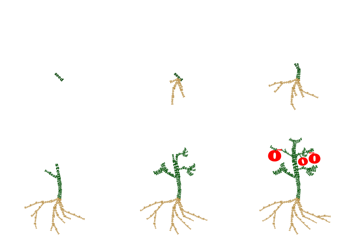
These are animations for the homepage.
Animated concrete poetry done in photoshop over the last week and a half of the project.

They are supposed to be a tomato plant, daffodil, carrot and cactus.

Tuesday 11 November 2008

Revised Radio


As the radio is fairly small in flash, we decided to make the buttons more obvious by introducing colour.

Monday 10 November 2008

Working Radio Download

A downloadable version of our working radio is available here. Open the download in a flash player.

This radio will sit on our site on top of every page to increase the already immense levels of fun to be had!!!

Radio Appearance


Combining these photographic elements, we have created our own radio which the user can interact with by pressing the buttons.

You can scroll through 5 garden related tracks!


Sunday 9 November 2008

Page transition

I've been playing with the transition between two pages of the site.
Stripping back layers to reveal a new page was something we thought about creating.

Photobucket

Toby

Interactive mirror

I came across this video today - quite a cool way of interacting.


Toby

Saturday 8 November 2008

Scrunch pt 2

Photobucket

I cut out the background from all of the layers in the crunch animaition. From there I was able to combine the images with the background and the 'on screen' image of the seed packet.

Toby

Friday 7 November 2008

Radio

I am having trouble with the radio. Not entirely sure how to control the sound file with the buttons. It is possible to have the radio looping but im not sure if that will have the desired affect.

Ill keep trying to sort this and hopefully it'll work but I may need help from Jonny or Jon. Al.

Thursday 6 November 2008

Scrunch!

To get the seed packet off screen we've decided to scrunch it up with a big hand. I've created an animation to try to create this effect. In order for this to work on top of our background I'll need to remove the white background.

Photobucket

Toby

Revised Background

We decided that a rough edged background could work better than a perfectly straight one. Here's a revised version I've been working on. I've also made a few other subtle changes, for example the feint diagram in the background has been swapped with one more fitting to our subject.


Toby

Background


Over the last few days we've also been working on our background image for the homepage and subsequent pages.
We wanted to achieve a relief/scrapbook type feel using collage and mixed media

Toby

The perfect garden song??


We need to start deciding on music to accompany the site. We like the idea of making it quite cheesy and tongue in cheek.
A radio in the garden to be tuned in to various different songs, the user selecting which they wish to listen to.

Toby

PACKET!

So yesterday we worked on the seed packet idea, creating both front and back designs for a packet containing "WONDER SEEDS".

This animation shows how the user will interact with the packet by clicking in dedicated hot spots.


Toby

Wednesday 5 November 2008

Icon Ideas & Research

I found all of these small icon style garden buildings that could be used as the traditional home icon on our site.

Tuesday 4 November 2008

Layout idea...

Once the user has clicked on a specific plant and it has grown, an extra reed could grow along the top of the screen with a semi-transparent box rolling down full of the information.

Concrete Poetry or Not So


The first illustration, by Kate Sutton, shows how typography can be used within an illustration or image meaning that the image doesn't have to be completely replaced. This will allow our group to maintain a typographical based project but including very appropriate illustrations.

Also, rather then making objects out of words, we could make words out of appropriate objects as shown here. This is almost a reverse of concrete poetry and is another
 effective typographical tool which could be incorporated into our website.

Collage Illustration


These illustrations by Tim Rehm & Tim Surken use collage effectively to create a dsitiinctive visual style.

The second image shows how this style could be used in imagery similar to our subject. I feel our audience could relate to this style and it would also be effective for creating unique navigation on our website.

Illustration Style

Following on from Anna's & Toby's illustration research, I found this piece by Takeru Toyokora. Using felt and card, pieces are cut out and laid down to create a flat piece of artwork that appears full of depth. This method could be used to create an interesting and effective website. The visual style is very distinctive and one that could relate to our topic and audience.

Monday 3 November 2008


Playing with seeds packets...

Toby
Following on from what Anna's been looking at, I found some contemporary illustrators that have a similar approach to Emily Gravet.

Michelle Thompson


Toby

Sunday 2 November 2008

style ideas


Some images from Little mouse's big book of fears by Emily Gravet.
The rough illustrations and torn up collages look quite effective, using images like this would give our site a tactile feel even on screen.

Saturday 1 November 2008

Typographic Plant


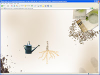
This is just an idea about having a typographic tree as the home page. The idea is that you start with nothing and then click on the seeds or seed packet to plant the seed, then click on the watering can to water etc, there could also be weather controls etc. 
Once the tree has grown the visitor could roll over one of the words to find the links to the other pages.